On August 2025, Cracker Barrel unveiled a new logo. For the first time in 48 years, it didn’t include Uncle Herschel, the man in overalls leaning against a barrel. In his place was a pared-back wordmark, part of a broader push to modernize the brand.
Customers didn’t see a refresh. They saw a company erasing the one thing they recognized. The backlash spread across social media within days, and a week later the company reversed course. “Our new logo is going away and our ‘Old Timer’ will remain,” it announced on August 26.
Cracker Barrel threw the baby out with the bathwater. In trying to look current, it traded nearly five decades of recognition for a look that could have belonged to any chain on the interstate.
That’s the quiet risk inside every trend report. LogoLounge’s 2026 Logo Trend Report, built from more than 30,000 logos and identity systems reviewed over the past year, is the most reliable map of where identity design is heading. But a map isn’t an itinerary. Even its author, Bill Gardner, is blunt about it: “This is a report, not a recommendation.”
So here’s a practical read on the logo design trends 2026 has produced: what they are, which ones make sense for a B2B brand, and how to borrow from them without losing the face your customers already know.
What the 2026 Logo Trend Report Actually Says
The biggest shift isn’t a shape. It’s behavior. Gardner describes identities that flex, pulse, and adapt, moving from a fixed artifact to something more expressive and responsive. A few themes run through the whole report:
- Backgrounds join the identity. Blurred, refracted gradient fields now carry as much of the brand’s mood as the mark sitting on top of them.
- Designers hand over frameworks, not just files. Studios are building controlled systems that let clients dial intensity up or down without breaking the brand. Gardner points to Koto’s work for MassiveMusic, which turns sound into generative visuals.
- 3D is everywhere. AI and modern rendering tools have made tactile, dimensional icons a core ingredient rather than a special effect.
- Type leans forward. Italics and obliques add momentum to otherwise static wordmarks, and a few designers lean letters backward for tension.
- Counters get filled. The open spaces inside letters are being plugged with unexpected objects: hearts, eggs, hammers, squares where circles belong.
Then there’s color. Green isn’t just having a moment; the report calls it a takeover, running from warm, organic greens to electric, yellow-leaning ones. YInMn blue is holding on, with yellows and purples rounding out the palette.
If you’ve seen The Devil Wears Prada, you know where this goes. In Miranda Priestly’s famous cerulean speech, a color chosen on a runway trickles down season by season until it lands in a clearance bin. Logo trends travel the same road. Today’s electrified green belongs to a handful of bold identities. In two years, it’ll be a default swatch in every template library.
The report even names what’s already worn out: script L monograms with a looping flourish, feathers, pennants, and, somehow, a crop of watermelon marks.
The 15 Logo Design Trends of 2026, in Five Groups
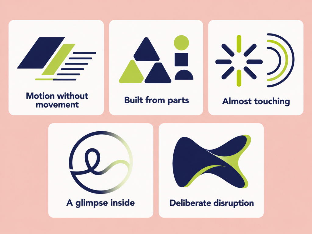
LogoLounge names 15 trends this year. Most fall into five families, and the family tells you more about fit than the individual name does. (The full report shows examples of each.)
1. Motion without movement
These marks feel like they’re going somewhere, even printed on a business card.
- Slant Break: a single italic letter inside an otherwise upright wordmark. One small lean adds distinction, and in a combined name it can mark where the two words meet.
- Slash Bar: parallelograms used as building blocks, stacked, overlapped, or stretched into directional cues.
- Piano: stepped parallel lines. The look took off with Robert Miles Runyon’s “Stars in Motion” logo for the 1984 Los Angeles Olympics, spread to everything from trains to donuts, and wore out. It’s back now, quieter and more about rhythm than speed.
- Phasers: rotation shown as separate steps, like frames of a flipbook, instead of one smooth blur.
- Roll Over: ribbons and sheets that roll instead of creasing, giving flat marks a sense of tension and volume.
2. Built from parts
These marks assemble a whole from a few simple pieces, which makes them easy to explain and easy to scale.
- Colorforms: a small kit of flat geometric shapes with deliberate gaps between them, often resolving into a monogram. The name comes from the 1950s toy, whose own logo was designed by Paul Rand.
- Tri-Link: a triangle built from three linked parts, each carrying its share of the load.
- Quad Quivers: four arrows packed into a square. Read one way, they’re aligned on a shared goal; read another, they’re competing for the center.
- V Balls: circles with raised, V-shaped arms, a chorus of figures celebrating, often spun around a central point.
3. Almost touching
The energy in these marks comes from the space between elements.
- Open Axis: asterisk-like arrangements of arrows, wings, or branches that stop just short of meeting.
- Echo Arcs: concentric curved lines that overlap and rise, suggesting connections forming and systems building on each other.
- Slip Knots: the first letter’s tail loops into a knot. The best versions let that letter break away as a standalone icon because it’s drawn from the same strokes as the rest of the name.
4. A glimpse inside
- Faders: a defined shape, like a circle or hexagon, with a line pathway inside that fades into a gradient. It hints at an intelligent system at work, which is why it shows up so often on AI and software app icons.
5. Deliberate disruption
- Breezy: letterforms that look warped or pinched, as if they’d been through a wind tunnel.
- Crack: wildly exaggerated ink traps that can tip into unintended interpretations. Gardner himself flags this one as risky unless provocation is part of the brief.
Adopt, Test, or Skip: Which 2026 Logo Trends Fit a B2B Brand
Most B2B brands should borrow from the quieter, structural trends and leave the provocative ones to consumer brands that can afford a double take. Here’s our take.
| Verdict | Trend | Why it can work | Watch out for |
| Adopt | Slant Break | One change adds distinction to a plain wordmark; good for firms with combined or long names | Use it on one letter, not three |
| Adopt | Tri-Link | Tells a real three-part story, like design, build, and maintain | Needs an actual three-part idea behind it |
| Adopt | Colorforms | Simple shapes scale cleanly from favicon to building sign | A broad palette needs strict color rules |
| Adopt | Slash Bar | Signals progress and direction without a tired swoosh | Can feel generic if it isn’t tied to a concept |
| Test | Slip Knots | Gives a wordmark a built-in icon for apps and social avatars | The icon must share the wordmark’s strokes |
| Test | Echo Arcs | Suits networks, infrastructure, and connection stories | Fine lines blur at small sizes |
| Test | Phasers, Roll Over | Strong in motion for digital-first brands | The static version still has to read on paper |
| Test | Faders | A natural fit for software and AI products | Feels borrowed if you aren’t a tech company |
| Skip | Crack, Breezy | Built to provoke a reaction | Legibility and credibility both suffer |
| Skip | Script L monograms, feathers, pennants | Already saturated, per the report | You’ll look like everyone else |
Before You Borrow a Trend, Ask Four Questions
A trend earns a place in your identity only if it passes all four of these.
- Does it say something true about your business? A Tri-Link mark for a firm with a three-stage process tells a story. The same triangle on a brand with no three-part idea is decoration, and decoration dates fast.
- Does it still work at 16 pixels? Most people first meet your logo as a browser tab, an app icon, or a LinkedIn avatar. If the trend’s best detail disappears at that size, it’s the wrong trend for you.
- Will it look dated in five years? Piano lines went from fresh in 1984 to a default setting within a few years. The faster a look spreads, the shorter its shelf life.
- Does it keep your face? This is the question Cracker Barrel skipped.
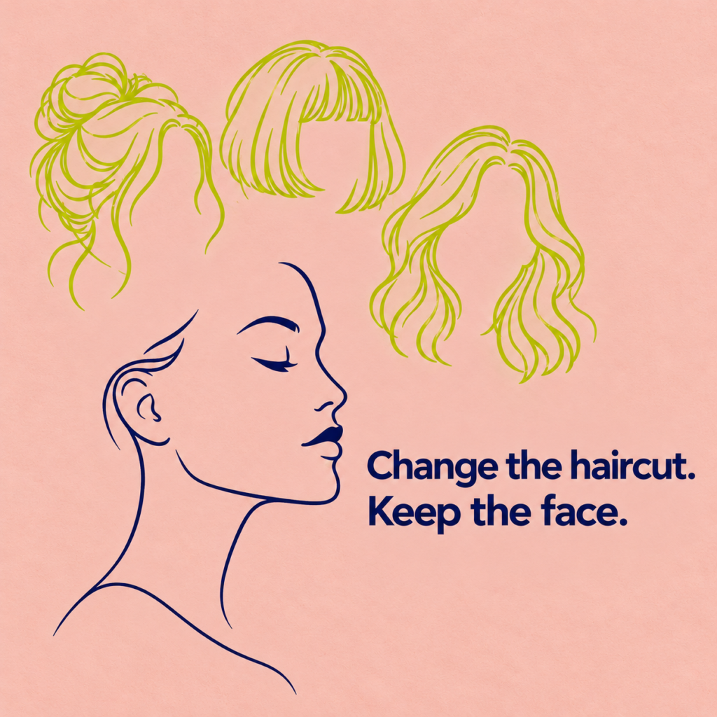
Think of trends as a haircut and your core mark as your face. Change the haircut every season if you like; people still know it’s you. Change the face, and they don’t. Cracker Barrel’s mistake wasn’t wanting to look modern. It was removing the face.
That recognition is worth more than any trend because it’s what turns familiarity into trust. As we’ve written about the role of graphic design in building brand trust online, consistency is what lets customers recognize you before they’ve read a word.
Build a Logo System, Not Just a Logo
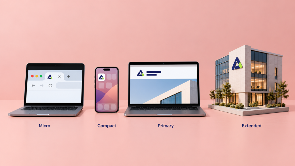
For most businesses, the most useful idea in the 2026 report isn’t a shape at all. It’s structure. A logo now has to work as a family of versions, each sized for a job:
- Micro: browser tabs and notifications. The simplest silhouette you own, with no fine lines and no small text.
- Compact: app icons and social avatars. A symbol or monogram that stands on its own.
- Primary: your website header, proposals, and email signature. The full logo as most people picture it.
- Extended: building signage, trade-show walls, and video intros. This is where motion, gradients, and taglines have room to breathe.
That structure is also where trends belong. Let the extended tier, campaign graphics, and color accents follow the season, and keep the micro and compact tiers steady. Your customers get something fresh to look at without ever wondering whether they’ve found the right company.
Write those rules down. Clear brand guidelines and design briefs and art direction are what keep a flexible system from drifting into an inconsistent one.
What This Means for Your Brand
Trend reports show where identity design is moving. Whether your brand goes along is a business decision, not a design reflex.
The best logo in 2026 isn’t the one carrying the most trends. It’s the one that still reads at 16 pixels, still says something true about the company, and still looks like the brand your customers trusted last year. Borrow a trend where it adds meaning, keep it in the flexible layers of your system, and protect the core mark.
If your logo genuinely looks like it belongs to another decade, a refresh may be overdue; here’s what it means when your brand feels stuck in the past. If it’s working, a lighter touch usually does more than a reinvention. Either way, it’s worth getting an outside view before you change anything customers have learned to recognize. That’s exactly what our branding and corporate identity work is built for.
Not sure which camp your logo is in? Let’s talk it through. We’ll tell you honestly whether it needs a new haircut or simply more confidence in the face it already has.

