

A marketing director we’ll call Sarah pulled up her company’s LinkedIn analytics on a Tuesday morning last spring. Eighteen months earlier, the launch had been loud: a new logo, a founder interview on a well-known podcast, three trade publications running the story in the same week. Prospects mentioned the brand unprompted in sales calls. Then, slowly, the mentions stopped. The blog kept publishing. The social calendar stayed full. Somewhere in month nine, the company had become one more name in a crowded feed, technically active, functionally forgotten.
Sarah’s team hadn’t gone quiet. They’d published forty-plus pieces of content that year. What they’d lost was the thing that made any of it recognizable as theirs.
This happens to B2B brands with more regularity than founders like to admit. A strong launch generates a burst of attention, the team mistakes that attention for momentum, and the content machine keeps running long after the brand identity underneath it has started to blur. The volume is there. The system holding it together is not.
What this article covers:
- The real difference between a content schedule and a brand system, and why one without the other quietly fails
- What brand equity actually means for a B2B company, in terms a CFO would recognize
- How message and visual identity work as one system, not two separate line items
- What the first 90 days of rebuilding that system actually looks like
If your brand feels like it’s publishing without being remembered, the diagnosis usually isn’t a content problem. It’s a systems problem. Here’s how to tell the difference, and what to do about it.
The Difference Between a Content Schedule and a Brand System
A content calendar answers a simple question: what goes live, where, and when. Useful? Absolutely. That’s scheduling, not identity.
A brand system answers a harder question: what should anything we publish unmistakably feel like, no matter who wrote it or when it went out. Microsoft’s own brand guidelines describe this as visual and verbal rules that keep an organization recognizable across every touchpoint, so each piece reinforces the last instead of starting from zero.
That reinforcement isn’t cosmetic. Research in the International Journal of Research in Marketing found that consistency in advertising content strengthens how memorable and retrievable a brand becomes. Per UCSF’s brand guide, consistent use of a visual system helps every asset feel like it came from the same place, even as the format changes.
Sarah’s team had a calendar, forty-plus posts a year. What they lacked was a system telling that content who it belonged to.
“A full calendar can still produce an empty brand.”
What Brand Equity Actually Means for a B2B Company
Marty Neumeier put it plainly in The Brand Gap: “A brand is a person’s gut feeling about a product, service, or company.” A company can publish a mission statement, a tagline, a full style guide, and the brand still ends up being whatever forms in the prospect’s mind when nobody’s watching.
“The brand isn’t the thing you built. It’s the thing your customer decided you are.”
Neumeier’s larger point is that gut feeling is built on trust, accumulated one interaction at a time. In B2B, where deals move slowly and involve several people signing off before anyone signs a contract, that trust is the actual asset. Followers, likes, and impressions measure attention. They don’t measure whether a prospect can say your name with confidence in front of their boss.
Here’s what it costs when they can’t: a marketing director sees your ad, reads a case study three weeks later without connecting the two, then gets a cold email from your team and asks “wait, have I heard of these people?” Each touchpoint reset to zero instead of building on the last one. Equity never had the chance to build there, no matter how much content shipped in the meantime.
Inside the System: How The Storyteller and The Good Looks Work Together
Split a brand into two questions and the system becomes obvious. What are we saying, and what does saying it look like? The Storyteller carries the first: strategy, blogs, social captions, email, the words that move across every channel a prospect might encounter. The Good Looks carries the second: the visual grammar that makes those words instantly recognizable before anyone reads a single one.
Picture a LinkedIn post, a blog header, and a client proposal sitting side by side. Same color palette. Same type treatment. Same voice underneath the copy, whether it’s a punchy caption or a 1,500-word article. A prospect scrolling past any one of those three shouldn’t need a logo to know who made it.
That’s the mechanics of it. The Storyteller writes the sentence that reframes a client’s problem in a way competitors haven’t. The Good Looks makes sure that sentence shows up in a navy-and-green palette, a specific header font, a tone in the imagery that matches the tone in the copy. One team without the other produces either a brand that sounds sharp but looks generic, or one that looks polished and says nothing memorable. Together, they produce a single, recognizable signal, published in a dozen different formats.
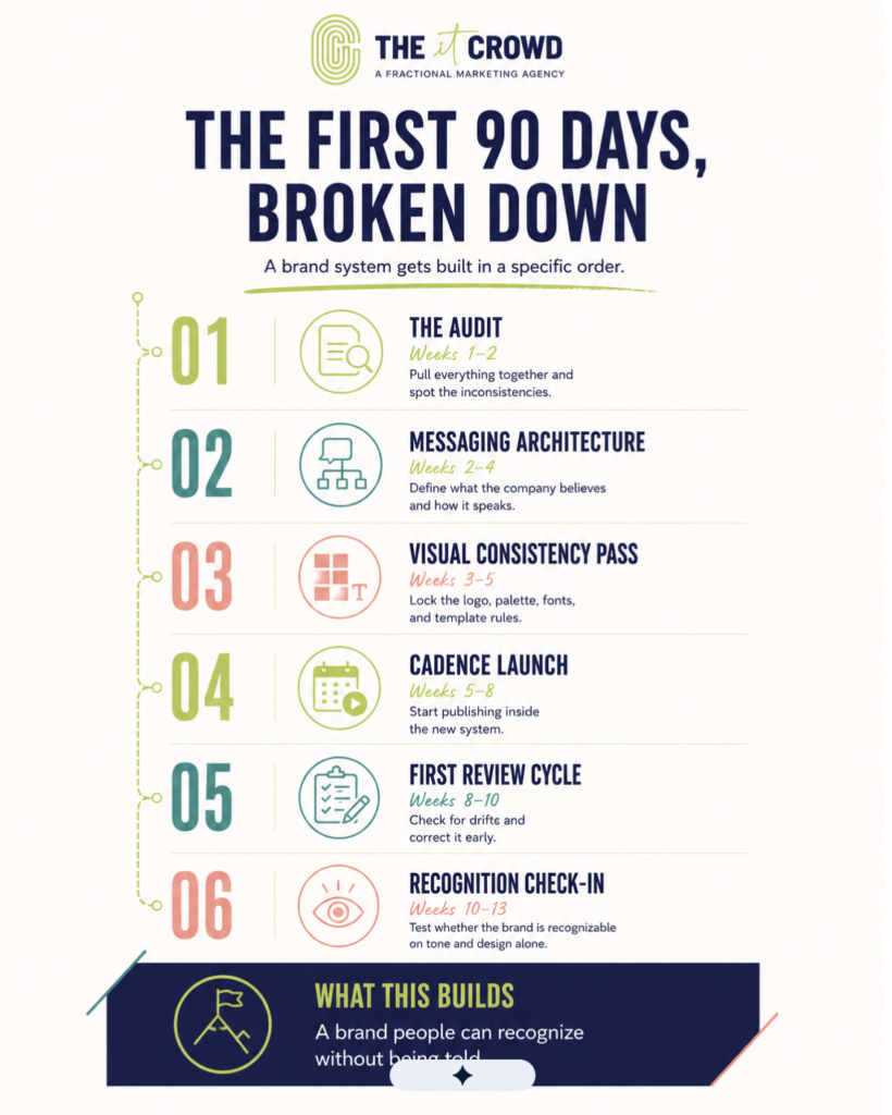
The First 90 Days, Broken Down
Sarah’s team didn’t need more content. They needed a system, and systems get built in a specific order. Here’s what that looked like once the work actually started.
- The audit (Weeks 1-2). Before anyone wrote a word, the team pulled every public-facing asset from the past year: the website, the last twenty social posts, three sales decks, the email nurture sequence. Laid side by side, the pattern was obvious. Four different tones of voice. Two logo variations nobody remembered approving. A tagline that had quietly changed twice. The audit turned up a company that had been improvising its identity in public for twelve months.
- Messaging architecture (Weeks 2-4). Next came the harder question: what does this company actually believe, and how does it say that consistently? The team built a messaging document, three core positioning statements, a list of phrases the brand would use and a list it would retire. Sarah’s favorite line from the old copy, “innovative solutions for modern business,” got cut in the first meeting. Nobody could say what it meant. That was the point.
- Visual consistency pass (Weeks 3-5). While the words got sorted, The Good Looks rebuilt the visual system: one approved logo file, a locked color palette, two fonts, and a set of rules for how photography got treated across every channel. Every template the team had cobbled together over the past year got replaced with one source file. No more guessing which blue was the real blue.
- Cadence launch (Weeks 5-8). With the architecture in place, publishing resumed, this time inside the system rather than around it. One authority piece a week, built to the new messaging and visual rules, distributed across the same channels Sarah’s team had always used. The difference wasn’t the volume. It was that every post now looked and sounded like it came from the same company that published the one before it.
- The first review cycle (Weeks 8-10). Six weeks into the new cadence, the team pulled the published content back together and checked it against the messaging document and visual rules built in weeks two through five. Two posts had drifted back toward the old, generic tone. Easy to catch, easy to fix, because there was finally a standard to catch it against.
- Recognition check-in (Weeks 10-13). By the end of the first quarter, Sarah ran an informal test: she sent five prospects a piece of content with the logo cropped out and asked if they knew who’d written it. Three of five got it right, based on tone and design alone. Three months earlier, the honest answer would have been zero.
That’s the arc: a system built in a specific order, tested against the thing that actually matters, whether a stranger can recognize the brand without being told.
Key Takeaways
- A content calendar answers when. A brand system answers why, how, and as whom. One organizes output. The other makes that output recognizable.
- Brand equity in B2B isn’t followers or impressions. It’s trust, accumulated one consistent touchpoint at a time, until a prospect can say your name with confidence in front of their boss.
- The Storyteller and The Good Looks aren’t two separate services stacked together. They’re one system: the words that carry the message, and the visual grammar that makes it instantly recognizable before anyone reads a line.
- The first 90 days follow a specific order: audit what’s actually out there, build the messaging architecture, lock the visual system, relaunch the cadence inside those rules, then test for drift and recognition.
- The real measure of success: strip the logo off a piece of content. Can a stranger still tell it’s you?
What Happens If You Wait
Nothing dramatic happens when a brand system stays unbuilt. That’s the trap. No single missed post costs a deal. No one blog article, off-brand as it might be, sinks a quarter. The damage is quieter than that: another year of content that resets a prospect’s memory back to zero every time, another twelve months of a marketing director wondering why the pipeline feels thinner than the publishing calendar suggests it should.
Sarah’s team didn’t wait much longer once they saw the audit laid out in front of them. Most companies in her position don’t need convincing that something’s off. They need someone to name it, then build the thing that fixes it.
If any of this sounds like your last twelve months, we’d like to hear about it. Let’s talk about what a real brand system could look like for your company.

