
What Is Web Design, and Why Does It Matter?
Web design is the planning of a website’s layout, content, navigation, and visual style so people can find what they need and take action. It covers how a site looks and feels. Web development turns that plan into a working website. Good web design also works across screen sizes and makes the site easier to use, access, and find through search.
For a business, that means more than choosing colors and fonts. A clear homepage, simple menus, readable text, and fast-loading images help visitors understand what you offer without extra effort.
I’m Lindsey Huettner, owner of The it Crowd, and I have more than 19 years of experience in marketing and business ownership. My work across branding, web development, content, and SEO shapes how I approach web design: start with the visitor, then make every page serve a clear purpose.
Fundamentals of Digital Interface and Website Architecture
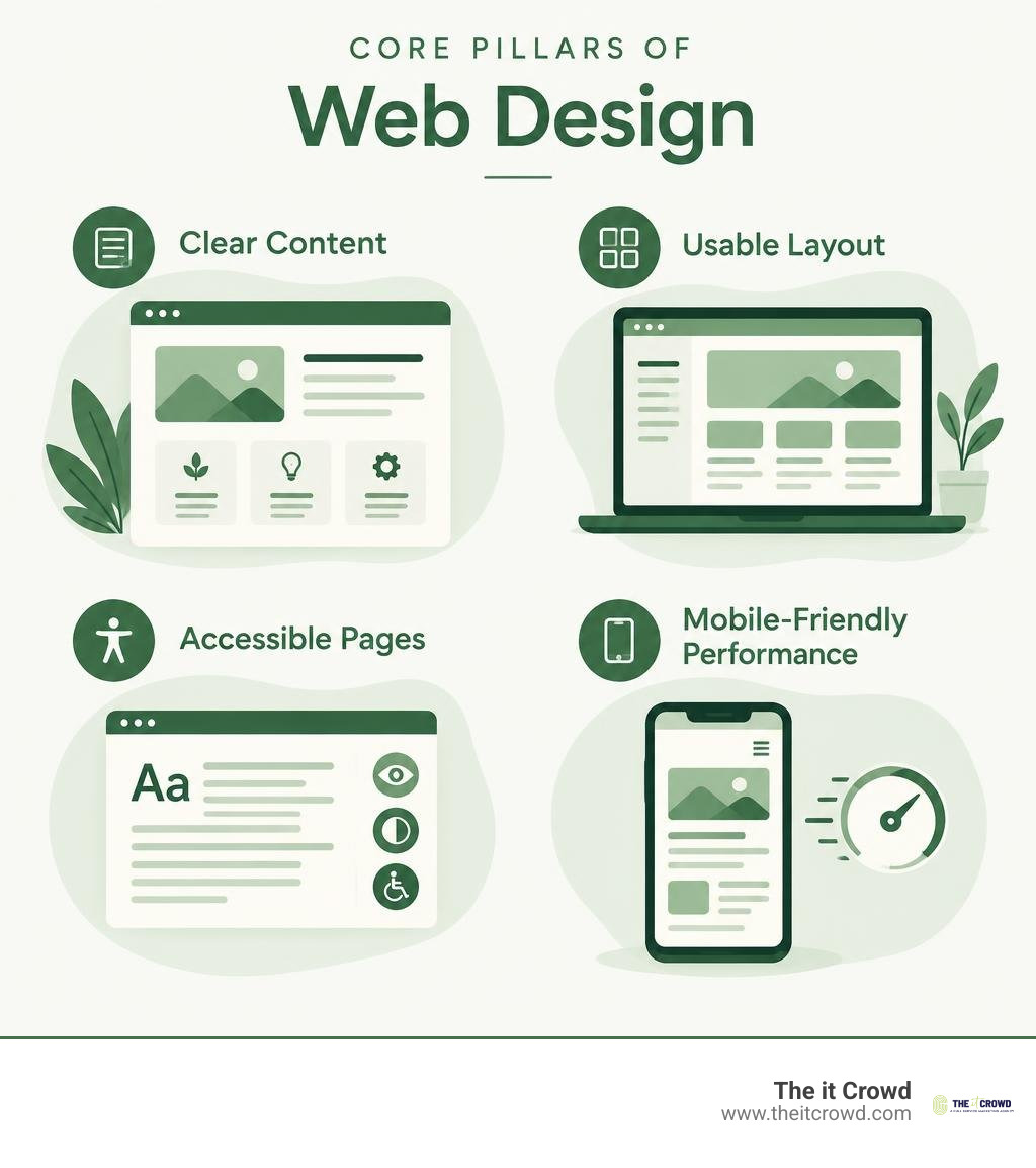
At its core, building an effective online presence means mastering both structural architecture and visual communication. When we talk about digital interfaces, we are discussing the bridge between human intention and digital execution. Beautiful aesthetics without structured information create confusion, while rigid code without visual appeal fails to engage users.
Mastering foundational web design concepts requires balancing usability standards, typography, visual hierarchy, and interface layout. To truly understand how modern websites function, it is essential to distinguish between the creative architecture of design and the engineering discipline of development.
| Dimension | Web Design | Web Development |
|---|---|---|
| Primary Focus | User experience, visual layout, branding, and aesthetics | Technical functionality, data processing, and site logic |
| Core Skillsets | UI/UX research, wireframing, color theory, typography | Frontend/backend programming, database management, security |
| Primary Tools | Figma, Adobe Creative Cloud, prototyping software | VS Code, Git, Chrome DevTools, web frameworks |
| Key Output | Interactive prototypes, design systems, visual assets | Production code (HTML/CSS/JS), servers, dynamic applications |
Understanding this distinction clarifies why cross-disciplinary collaboration produces superior digital products. When designers understand structural constraints, they build interfaces that are technically feasible and high-performing.
The Evolution from Static Pages to Dynamic Systems
Digital layout techniques have advanced dramatically over the past three decades. In the late 1980s and early 1990s, the web consisted of basic text documents. By the mid-1990s, designers began repurposing HTML tables—originally engineered strictly for tabular data—to construct complex multi-column layouts. This turned web pages into rigid digital spreadsheets.
The introduction of Cascading Style Sheets (CSS) by the W3C in December 1996 fundamentally shifted the discipline by separating content from presentation. This evolution gained momentum during the browser wars of the late 1990s and early 2000s. By 2001, Internet Explorer controlled roughly 96% of browser market share, often requiring proprietary workarounds.
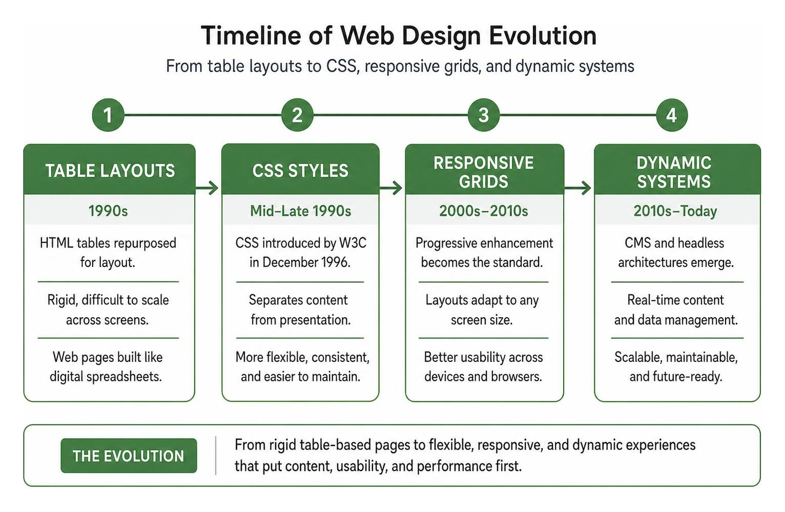
As web standards solidified, the concept of progressive enhancement emerged: building a robust base layer of content and semantic HTML that functions on any browser, then layering advanced CSS styling and JavaScript interactions on top for modern devices. Today, dynamic Content Management Systems (CMS) and headless architectures allow businesses to manage real-time data seamlessly while preserving code quality and visual integrity.
Responsive vs Adaptive Layouts
Today’s audiences view content across smartphones, tablets, laptops, and ultra-wide desktop monitors. Designers address this screen diversity through two primary methodologies: responsive layouts and adaptive layouts.
Responsive web design relies on fluid grids, proportional sizing units, flexible media, and CSS media queries. The layout smoothly rearranges and scales its elements to fit any screen dimensions. It provides a consistent maintenance workflow and ensures uniform content delivery, which aligns perfectly with modern mobile-first indexing standards.
Adaptive web design creates distinct, fixed layouts for specific device breakpoints (such as 320px, 768px, and 1200px). When a visitor accesses the page, the server or browser detects the device context—including screen size and network bandwidth—and delivers the custom layout optimized for that specific profile. While adaptive setups can reduce payload sizes on mobile devices, responsive design remains the industry standard due to its flexibility across hardware releases.
Core Principles of Effective Web Design
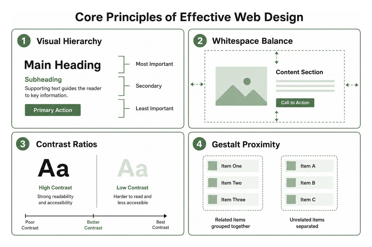
High-performing websites rely on fundamental principles of human perception and cognitive psychology. Applying Gestalt principles allows us to direct user attention naturally toward key actions. Spatial grouping and visual balance ensure that visitors absorb information without feeling overwhelmed.
Strategic color psychology and contrast ratios also play a major role in brand perception. Harmonizing your digital assets with top brand logo design trends reinforces your visual identity across every customer touchpoint.
Typography and Spatial Hierarchy
Web typography accounts for more than 90% of visual communication on the internet. Selecting harmonious font pairings, establishing proportional line heights, and controlling character measure (ideally 45 to 75 characters per line) directly influence scannability. Most visitors do not read every word on a page; they scan in standardized F-shaped or Z-shaped viewing patterns.
Whitespace—or negative space—acts as visual breathing room. By maintaining generous spacing between sections and using micro-interactions on buttons, you establish a clear visual hierarchy that guides the reader’s eye to high-priority information without cognitive friction.
Navigation and Information Architecture
Information Architecture (IA) serves as the structural blueprint of your site. It defines how content is categorized, labeled, and discovered. A logical sitemap structure, complemented by breadcrumb trails, guarantees that visitors understand where they are and how to reach their destination in as few clicks as possible.
When organizing site menus and interactive overlays, keep these architectural guidelines in mind:
- Limit primary navigation options to seven items or fewer to minimize decision fatigue.
- Use descriptive labels rather than clever, ambiguous phrasing for critical categories.
- Implement sticky or persistent navigation on long-form content pages to ease scrolling effort.
- Use modal overlays sparingly, ensuring they do not interrupt key user journeys or block critical navigation.
The Intersection of UX, SEO, and Accessibility
Search engines evaluate web properties using criteria that mirror human user preferences: page speed, mobile usability, structural clarity, and engagement metrics. A design that prioritizes user experience inherently supports search visibility.

Integrating technical search requirements with intuitive layouts ensures that both search engine crawlers and real visitors find value in your content. Conducting a comprehensive pre-Q4 website audit helps uncover technical obstacles, slow-loading assets, and structural flaws before high-traffic shopping and lead-generation cycles begin.
Designing for Universal Accessibility (WCAG)
Digital accessibility means making websites usable for everyone, including people with visual, auditory, motor, or cognitive impairments. Over 1.3 billion individuals worldwide live with significant disabilities, and working-age adults with disabilities in the United States alone hold roughly $504 billion in disposable income.
Ensuring your digital properties meet Web Content Accessibility Guidelines (WCAG) is both good business and a legal priority. With over 5,000 digital accessibility lawsuits filed across the United States in 2025, accessible design is an essential standard for modern enterprises.
Key accessibility implementation practices include:
- Color Contrast: Maintain a minimum contrast ratio of 4.5:1 for body text and 3:1 for large typography and essential UI components.
- Keyboard Operability: Ensure all interactive elements, forms, and modals can be navigated and activated using only the keyboard.
- Semantic Markup: Structure content with accurate HTML header tags (
through) and landmark regions so screen readers can parse page hierarchy. - Descriptive Alternative Text: Provide meaningful
altattributes for informational images while marking purely decorative visuals as hidden from assistive tech.
UX Factors That Drive Search Visibility
Modern search engine ranking systems prioritize the real-world user experience. Factors such as dwell time, interaction responsiveness, and layout stability play an active role in how search algorithms evaluate your website.
When pages load quickly and feature stable, intuitive layouts, bounce rates drop and organic engagement improves. Conversely, frustrating elements like unoptimized slider carousels hurt conversions and search rankings. Studies show hero carousels suffer from low click-through rates, add unnecessary script overhead, and trigger banner blindness. Replacing complex carousels with focused, high-contrast hero sections improves both page speed and conversion paths.
Modern Tools, Technologies, and Industry Workflows
Modern design workflows rely on collaborative, cloud-native tool ecosystems that connect conceptual ideation with production code. Designers create vector-based UI kits, interactive prototypes, and scalable component systems before engineering begins.

Designers frequently leverage curated UI templates and inspiration to explore interface layouts, standardize design systems, and speed up wireframing across varied client projects.
How AI Is Transforming Web Design Workflows
Artificial intelligence has become a standard asset in modern design workflows. Rather than replacing creative direction, AI tools handle routine operational tasks and accelerate visual ideation.
AI tools assist modern teams by:
- Generating preliminary wireframes and site architecture maps based on functional requirements.
- Creating contextual copy variations to test layout spacing before final content integration.
- Automating repetitive image adjustments, background removals, and responsive asset formatting.
- Running predictive accessibility audits to catch color contrast and labeling issues early.
Essential Skills for Modern Web Design Careers
The digital design industry offers strong compensation and career advancement for professionals who combine visual artistry with technical fundamentals. Web designers in the United States earn an average salary of approximately $52,691 per year, with experienced professionals and specialized UX designers earning $74,000 or more annually.
Industry projections indicate that over 3.4 million UX-focused design positions will be created over the next decade. Developing a well-rounded skill set requires following a structured career roadmap and learning guide that covers visual design principles, basic frontend code, design systems, and user research methodologies.
Strategic Homepage Layouts and Usability Best Practices
Your homepage serves as your brand’s digital front door. It must communicate your core value proposition within seconds while guiding different visitor segments toward meaningful actions.
Many businesses partner with a specialized brand experience design agency to build a unified design system that blends messaging, aesthetic appeal, and technical performance across every digital touchpoint.
Crafting High-Converting Hero Sections
The hero section sits directly above the fold and shapes your visitor’s first impression. To convert attention into engagement, design your hero area around these strategic elements:
- A Clear Value Proposition: Craft a concise, bold headline that explains what your company does and why it matters to your ideal customer.
- A Primary Call-to-Action (CTA): Use high-contrast buttons with action-oriented text that tells visitors exactly what to expect next.
- Compelling Supporting Media: Showcase real product interfaces, authentic brand imagery, or subtle background video that reinforces your messaging without slowing page load times.
- Visible Trust Signals: Display client logos, industry certifications, or brief customer review badges near your CTA to build credibility immediately.
Usability Testing and Iteration
Great design is not static; it evolves through continuous user feedback and data analysis. Implementing disciplined usability testing ensures your website consistently meets real customer needs and business objectives.
By tracking user click heatmaps, analyzing scroll maps, and testing headline variations or button placements, you uncover friction points that disrupt conversions. Iterating your layout based on behavioral data keeps your site high-performing and user-focused over time.
Frequently Asked Questions About Website Creation
What is the primary difference between a web designer and a web developer?
A web designer focuses on visual aesthetics, information architecture, interface layout, color theory, and user experience. They plan how the website looks, feels, and guides the user. A web developer takes those design blueprints and writes the production code (using HTML, CSS, JavaScript, and backend languages) required to build a functional, secure, and interactive website.
How do modern user experience practices impact search rankings?
Search engines prioritize websites that deliver fast, stable, and user-friendly experiences. Core Web Vitals evaluate loading speeds, interactivity, and visual stability during page render. When user experience best practices are implemented—such as intuitive navigation, mobile responsiveness, and clean semantic code—visitors stay longer, bounce less frequently, and engage deeper, which signals strong search value.
Why are slider carousels discouraged on modern homepages?
Slider carousels frequently harm both usability and technical performance. Research shows that less than 1% of visitors click beyond the initial slide, while subsequent slides suffer from banner blindness. Additionally, complex carousel scripts often increase page load times, shift visual layouts unexpectedly on mobile devices, and introduce accessibility barriers for screen readers and keyboard users.
Conclusion
Building a successful website requires balancing visual branding, intuitive architecture, search engine optimization, and accessibility. When every element serves a distinct strategic purpose, your digital presence turns passive visitors into loyal customers.
We deliver tailored solutions across web development, branding, digital marketing, and automated workflows. If you are looking to elevate your online presence, find a reliable partner through an essential guide to finding a reliable digital marketing agency or explore our professional digital solutions to build high-performing digital experiences for your brand.

