
What Brand Logo Design Trends From 2025 Mean in 2026
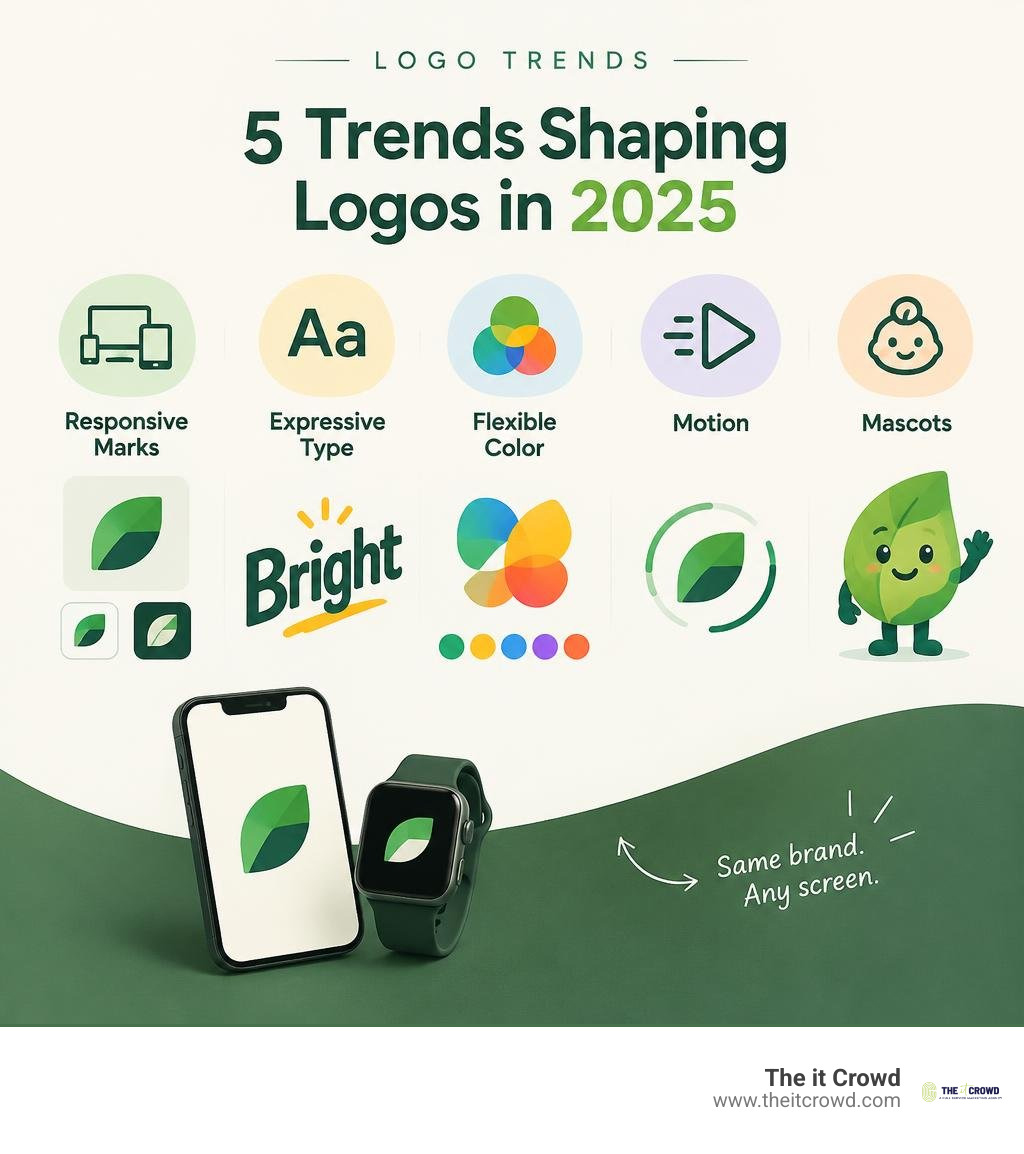
The logo trends worth carrying forward are responsive marks, distinctive simple shapes, custom lettering, flexible color, subtle motion, and mascots with personality. AI can speed up early ideas, but a designer still needs to choose what fits the brand. For a business, the best test is simple: does the logo look like you on a smartwatch, an app icon, and a storefront?
These shifts reflect a wider pull between bold, tech-driven design and warmer, nature-inspired design. LogoLounge’s 2025 Logo Trend Report drew on more than 30,000 logos from over 120 countries. The point isn’t to follow every trend; it’s to find the few that make your brand easier to recognize.
I’m Lindsey Huettner, owner of The it Crowd, and I use insights from brand logo design trends 2025 to help businesses make practical branding choices. My 19-plus years in marketing and business ownership have taught me to look past what’s new and focus on what will last.
Introduction
Visual identity has moved far beyond a single static emblem stamped across corporate stationery. Looking at brand performance data, organizations that actively maintain and modernize their visual presentation achieve up to a 42% higher brand recall than competitors running outdated graphics. If you find yourself feeling like your brand is stuck in the past, you are not alone.
The benchmark 23rd edition of the LogoLounge study analyzed more than 30,000 active marks submitted across 120 countries, alongside thousands of high-profile global redesigns. What emerged is a fundamental shift in how marks are built, scaled, and remembered.
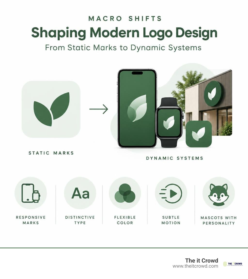
Rather than superficial aesthetic fads, today’s identity updates solve concrete business problems: ultra-small screen visibility, cross-platform adaptability, and emotional resonance in an automated world.
The Dual Forces Driving Brand Logo Design Trends 2025
The visual landscape is defined by a cultural tug-of-war. Rather than converging into one uniform style, identity design has split into two energetic trajectories. Building upon the foundational graphic design trends in 2024, modern designers are navigating between hyper-digital futurism and grounded, tactile sustainability.
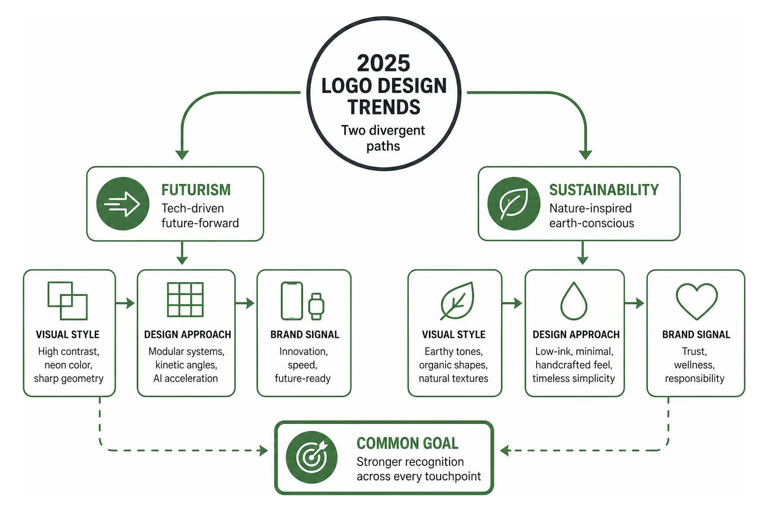
As highlighted in the 2025 Logo Trend Report – LogoLounge, designers stand at a crossroads watching two distinct movements head down the highway: one powered by AI acceleration and neon-tinted digital spaces, and the other anchored in environmental consciousness, low-impact printing, and organic warmth.
Futurism vs Sustainability: The Core Tension in Brand Logo Design Trends 2025
This design tension affects every visual choice a company makes. Tech-forward brands lean into high-octane chroma, sharp kinetic angles, and modular geometry to signal innovation and speed. In contrast, wellness, lifestyle, and consumer goods brands embrace natural textures, low-ink silhouettes, and earthy pigments to communicate environmental responsibility.
| Design Element | Futurist / AI-Driven Approach | Sustainable / Nature-Inspired Approach |
|---|---|---|
| Color Schemes | Ultra-chroma neon, chartreuse, YinMn blue | Terracotta, sage green, clay, unbleached warm neutrals |
| Geometry | Crisp angles, modular grids, precision cuts | Flowing contours, soft coves, organic pebble forms |
| Typography | Reverse-stress, dynamic kinetic, geometric sans | Hand-hewn quirks, warm serifs, textured bespoke letterforms |
| Physical Application | Screen-first, high-contrast dark mode | Low-ink footprints, debossed unbleached substrates, soy inks |
| Brand Tone | Disruptive, agile, technologically capable | Grounded, ethical, restorative, human |
Finding where your company belongs along this spectrum requires strategic clarity. Through our work in brand positioning, we help businesses choose the right visual language to express their unique market space without looking like a generic commodity.
Mascot Revival: Humanizing Tech and Eco-Conscious Identity
Mascots are making an unprecedented comeback. As artificial intelligence automates customer interfaces and digital platforms risk feeling sterile, brand characters inject needed humor, charm, and emotional vulnerability into business identities.
This mascot revival splits neatly across our two core movements:
- The Digital-Futurist Camp: Employs witty robotic guides, dynamic geometric companions, and modular digital avatars that animate inside apps to walk users through onboarding.
- The Eco-Conscious Camp: Utilizes friendly retro-styled animals, botanical characters, and hand-illustrated figures reminiscent of mid-century park signs (the “Smokies” aesthetic).
To understand why this approach works, we often explore why some brands stick and others dont the psychology of brand memory. Character marks tap directly into human facial recognition pathways, creating instant emotional shortcuts that abstract geometric shapes take years to build.
Responsive Systems and Micro-Scale Functionality
Today’s marks must perform on everything from smartwatches with a 30-pixel footprint to massive side-of-building digital billboards. Static logos that cannot simplify collapse under these technical demands.

Industry studies, including The Logo Design Trends That Shaped 2025 (And How Brands Actually Used Them), reveal that major enterprises now eliminate proposed designs early if the core mark cannot remain unmistakably legible at a 16-pixel width. Designers no longer build large logos and scale them down; they build for the smartwatch screen first and expand upward.
Dynamic Hierarchies in Brand Logo Design Trends 2025
A modern logo is no longer a single artwork file. It is an organized responsive family consisting of distinct tiers designed for specific functional roles:
- The Core Emblem (Micro Tier): A stripped-down, highly geometric silhouette engineered specifically for smartwatch interfaces, browser favicons, and notification dots down to 16px.
- The Compact Mark (Mobile Tier): A balanced shorthand version—often an iconic symbol paired with simplified typography—tailored for mobile app headers, navigation bars, and social avatars.
- The Standard Lockup (Primary Tier): The complete horizontal or stacked configuration combining the signature mark, full bespoke wordmark, and optional descriptor for desktop sites and general marketing collateral.
- The Performer / Extended Lockup (Experiential Tier): The richest expression, featuring motion states, contextual taglines, and layered dimensions for trade show backdrops, digital billboards, and retail signage.
When adapting these digital marks into the physical world, maintaining crisp alignment is essential. Our team oversees these cross-channel transitions through our specialized work in package design and print, ensuring fine-line vector integrity translates perfectly from OLED screens to tactile packaging substrates.
Motion as a Structural Identifier
Motion is no longer an afterthought added by a video editor—it is built into the logo’s foundational identity guidelines. Large enterprises now allocate 30% to 40% of their identity documentation strictly to motion rules.
Key motion behaviors defining modern brands include:
- BlurTails: Linear motion blurs that signal high-speed data transfer, cloud computing, and real-time processing.
- SpinShift: Rotating multi-axis movements where geometric facets shift perspective as users interact with digital interfaces.
- Micro-Interactions: Subtle state changes, such as an icon gently breathing on cursor hover or expanding smoothly during pull-to-refresh mobile interactions.
To ensure performance across web and app environments, these dynamic assets are optimized into clean SVG and Lottie code rather than heavy video formats, accompanied by strict reduced-motion CSS media queries to respect user accessibility preferences.
Expressive Geometry and Abstract Minimalism
The previous era of “blanding”—where corporate identities universally discarded their personality in favor of identical geometric sans-serif fonts—has sparked a sharp visual pushback.

Brands are turning toward expressive, character-rich geometry to craft unmistakable silhouettes. Grounded in Gestalt psychology, these marks leverage closure and proximity to turn passive viewers into active participants. Through our core work in branding and corporate identity, we use these principles to build distinctive identities that stand out cleanly in crowded markets.
Controlled Geometry: Sharps, Smokies, Coves, and Squared
The recent LogoLounge analysis identified several specific geometric shape groups driving contemporary visual language:
- Sharps: Logos featuring deliberate, razor-sharp cuts at stroke termination points. This visual treatment conveys rebellious energy, high-performance precision, and technological agility.
- Smokies: Soft, rounded, deeply radiused corner styles reminiscent of carved national park timber signs. These shapes radiate safety, warmth, and nostalgia.
- Coves: Deep negative-space cutouts and scoop forms along outer silhouettes that prompt the human brain to mentally complete the missing geometry.
- Squared & PolyGrid: Modular, block-based structures that evoke early computing architecture, architectural stability, and cryptographic security.
- BorderLand: Marks framed within active architectural borders, giving the symbol structural containment across variable social media feeds.
Abstract Minimalism vs Blank Debranding
Abstract minimalism must not be confused with the sterile oversimplification of recent years. Where “blank debranding” stripped away history and character, abstract minimalism uses thoughtful geometric storytelling to layer meaning into a simple mark.
By using subtle asymmetries, clever negative space, and unexpected intersections, abstract minimalist logos remain easily identifiable even in silhouette. They provide companies with an uncluttered visual presence while retaining personality.
Typography Revolutions and Chromatic Polarity
Typography has broken free from generic system fonts. Wordmarks today use bespoke modifications and dynamic variable font technology to communicate brand tone at a glance.
Establishing this visual harmony across all marketing touchpoints requires clear creative guardrails. We outline these structural rules through our work in design briefs and art direction, giving internal teams the clarity needed to apply expressive type consistently across global campaigns.
Typographic Disruption: Typemelts, LongLegs, and Reverse-Stress
Several typographic movements have taken center stage:
- Typemelts: Letterforms that appear molten, fluid, or gently dissolving into adjacent characters, popular in streetwear, entertainment, and digital culture brands.
- LongLegs: Exaggerated vertical ascenders and descenders on custom serif and sans-serif fonts that lend elegance and architectural height to luxury and editorial brands.
- Reverse-Stress Type: Unexpected stroke weight distributions where horizontal strokes are thicker than vertical stems, delivering an offbeat, retro-futuristic aesthetic.
- Dynamic Variable Fonts: Typefaces configured to automatically alter their weight, optical width, and slant based on scroll position or device screen size.
Chromatic Polarity: Ultra-Chroma Brights Meets Dusky Earth Tones
Color strategy has diverged into two high-performing palettes:
On one side, tech and entertainment brands rely on high-energy hues—such as high-frequency chartreuse, electric violet, and the vibrant inorganic pigment known as YinMn blue—to slice through dark-mode digital interfaces.
On the other side, ethical and sustainability-driven businesses utilize warm terracotta, moss green, dusky ochre, and warm clays that evoke unbleached paper and natural ingredients. Many organizations now deploy adaptive color architectures, subtly adjusting the warmth of their brand palettes between day and night modes to match the user’s ambient environment.
The Role of AI: Shifting from Generation to Creative Curation
The conversation around artificial intelligence in design has matured. While AI platforms can generate hundreds of visual iterations in seconds, this speed has exposed a real bottleneck: idea overload.
When anyone can generate a logo in moments, raw generation becomes a commodity. The real value lies in curation, strategic filtering, and technical execution. We have written extensively on why ai tools fall short in developing authentic visual branding, because software lacks the lived cultural context required to build enduring symbols.
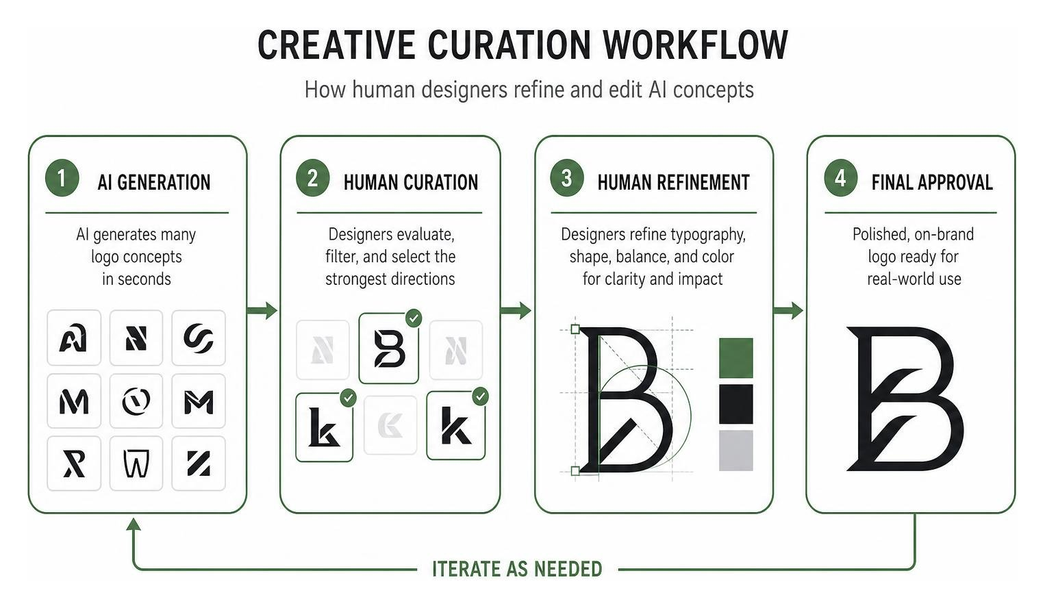
At The it Crowd, our proprietary AI infrastructure (“The Hive”) streamlines research, pattern recognition, and rapid iteration. However, human art direction remains essential to distill those outputs into polished marks.
True brand differentiation relies on human intuition, conceptual depth, and emotional storytelling. Understanding how human creativity enhances brand messaging beyond ai helps modern companies leverage AI as a capable assistant without sacrificing the authentic character of their visual identity.
Frequently Asked Questions About Logo Design Shifts
How do small-screen constraints influence modern logo geometry?
Small-screen constraints force designers to start at tiny dimensions (such as 16×16 pixel favicons and smartwatch screens) and build upward. This requires removing complex internal lines, increasing stroke weights, relying on high-contrast silhouettes, and utilizing Gestalt negative-space principles so marks remain instantly recognizable at a glance.
Why are brands choosing controlled updates over radical reinvention?
Radical reinventions often discard years of accumulated brand equity and disorient loyal customers. Leading global brands favor controlled updates—such as refining line weights, adjusting letter-spacing, and optimizing color palettes for dark mode—to modernize their visual presence while preserving immediate brand recognition.
How can brands adopt modern trends without losing brand equity?
Brands should adopt a modular identity system. Keep your core visual anchor (your primary silhouette or heritage mark) stable while using trends in flexible layers, such as seasonal color palettes, marketing typography, motion styles, and campaign graphics. This keeps your brand looking fresh without confusing your audience.
Conclusion: Building a Timeless Identity in a Fast-Moving Market
The defining lesson from recent visual trends is that modern identity design is no longer about picking a single static style and leaving it untouched for ten years. Success requires building a flexible, responsive visual system that preserves your core brand equity while adapting seamlessly across devices, platforms, and screen sizes.
Whether your brand leans into high-energy futurism or warm sustainability, avoid chasing visual fads that do not serve your underlying business goals. A truly great mark is built on clarity, technical versatility, and emotional truth.
To explore how our team builds distinct, future-proof identity systems that scale with your business, explore our guide on effective branding dos donts strategies and let’s craft an identity that lasts.

