Here’s the hard truth: nobody sits down with a cup of coffee to read your website word for word. They skim, scroll, and decide in seconds if your message is worth their time. And in those seconds, the smallest design details—your font hierarchy web design and color contrast accessibility—determine whether they stay or bounce.
This is where micro-UX comes in. It’s the quiet discipline of obsessing over the way text flows, how buttons stand out, and whether content is legible for every user, not just the ones with perfect vision and infinite patience. And guess what? Google notices too. Sites with better website readability UX, clearer hierarchy, and compliant WCAG 2.2 contrast ratio standards consistently rank higher because they deliver the signals Google values most: engagement, clarity, and trust.
At The it Crowd, we’ve learned that the real impact isn’t found only in big campaigns or viral creative. It’s hidden in the small choices designers and marketers make every day. Let’s break down why font hierarchy and contrast aren’t just “design decisions,” but real business drivers.
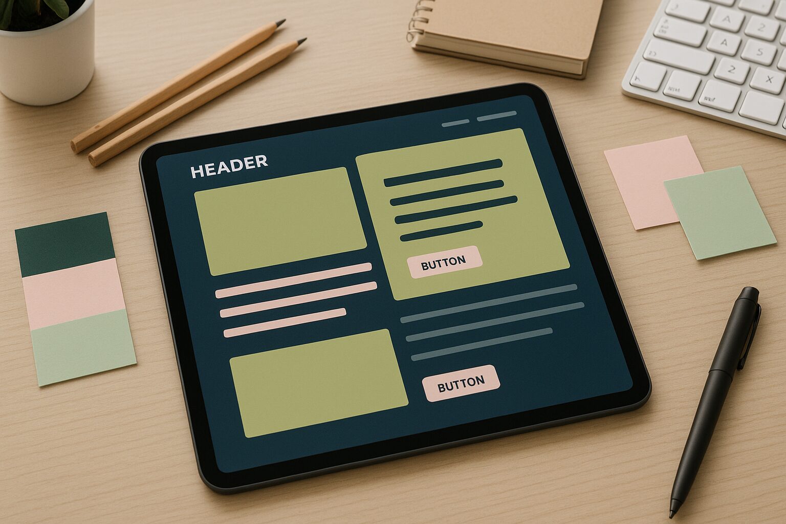
Font Hierarchy: Design That Leads the Eye
Have you ever landed on a page where every line of text feels identical? With no clear starting point, your eyes wander, and frustration kicks in. That’s where font hierarchy in web design proves its value, by creating a visual roadmap that leads the eye, signals what’s most important, and keeps readers moving through the content with ease.
Hierarchy is how you tell a visual story, it guides how users read, how quickly they grasp information, and how confidently they move through your site. Eye-tracking studies show people skim in predictable patterns—the F-pattern and Z-pattern—so if your headlines don’t anchor attention or your subheads don’t break up content, you’re leaving money on the table.
Why hierarchy matters for performance:
- It creates instant clarity. Readers know exactly what matters and what’s supporting detail.
- It saves cognitive energy. When your page is easy to scan, people actually stick around.
- It directly impacts conversions. Strong hierarchies naturally lead the eye toward CTAs.
Font hierarchy examples:
- Bad: A landing page where the headline, subhead, and CTA are all nearly the same size. Everything blends, so nothing feels urgent.
- Good: A product page where the H1 is bold and commanding, H2s divide sections with helpful cues, and supporting bullets create quick takeaways.
Fonts aren’t just about size, they’re about rhythm. Line height, weight, and spacing all contribute to how easily users can scan. Too little spacing, and text feels cramped. Too much, and it feels disjointed. Creating a type scale—consistent H1, H2, H3, and body sizes—establishes harmony across your site.
At The it Crowd, we’ve seen simple fixes like clarifying font hierarchy lift product-page conversions by double digits. It’s not flashy, but it’s effective.
Color Contrast: The Silent Gatekeeper of Usability
Have you ever tried reading pale gray text on a white background? Or squinted at a button that seemed to fade into its container? That’s poor color contrast accessibility at work and it’s one of the fastest ways to frustrate users.
Contrast determines legibility, and legibility determines whether users actually engage with your content. Low contrast isn’t just annoying, it excludes users with vision impairments and fails WCAG 2.2 contrast ratio standards, putting you at risk of compliance issues.
But contrast isn’t just about ticking accessibility boxes. It’s about creating a clear visual hierarchy that makes your site usable in real-world conditions, on mobile in bright sunlight, on old monitors, or in low-light environments.
Where contrast matters most:
- CTAs and buttons: These need to pop. If “Buy Now” looks like body text, you’re losing revenue.
- Body copy: Thin gray fonts might look sleek in design files but are torture in practice.
- Navigation: Menus are roadmaps. If they’re hard to read, users don’t just get lost—they leave.
Common mistakes:
- Designers using brand colors without testing accessibility ratios.
- Minimalist palettes that look elegant but fail usability.
- Relying solely on color (e.g., green for success, red for errors) without providing supporting text.
Color contrast is also emotional. High contrast creates clarity and confidence, while low contrast feels uncertain and passive. If you want people to take action, your calls-to-action need more than clever wording, they need bold contrast that instantly catches the eye and demands attention.
We’ve seen brands recover lost conversions simply by adjusting contrast on buttons. It’s a reminder that design choices aren’t just about “how it looks”, they’re about “what it does.”
UX = SEO + ROI
Here’s where it all comes together: good UX isn’t just a design win, it’s an SEO and revenue win. Google pays attention to engagement signals. If users bounce because they can’t scan your content or read your text, rankings suffer. If they stay, scroll, and convert, rankings rise.
How micro-UX impacts business metrics:
- Better readability and conversion rate: Clear hierarchy and contrast reduce friction, leading to more completed forms, clicks, and sales.
- Lower bounce rates: If users can find value quickly, they’re less likely to leave.
- Higher dwell time: Scannable pages keep users engaged longer, signaling relevance to Google.
Think of micro-UX as a compounding investment. Every second a user spends engaged increases the chance of conversion, and every positive signal you send to Google improves rankings. Over time, these details amplify not just UX, but marketing ROI.
DIY Audit: Quick Fixes You Can Do Right Now
Improving web typography best practices and color contrast guidelines for web accessibility doesn’t require a massive redesign. Many fixes can be implemented in hours, not months.
Here’s how to start:
- Run a contrast checker: Tools like WebAIM, Stark, or Contrast Ratio Analyzer will flag problem areas instantly.
- Standardize type scales: Create clear rules for H1, H2, H3, and body text sizes. Apply them consistently across pages.
- Check spacing: Proper line height (around 1.5 for body copy) boosts readability and accessibility.
- Test CTAs on mobile: Does your button pop, even in bright sunlight? If not, adjust colors or add outlines.
- Audit accessibility beyond color: Don’t rely only on hues. Use icons, labels, or patterns to reinforce meaning.
Don’t just audit in perfect conditions, test your site in “real-life” settings—on low battery, in airplane mode, or outdoors in glare. These situations reveal UX issues your design mockups never showed.
Why The it Crowd Obsesses Over Micro Details
We’ve seen it again and again: brands lose opportunities not because of weak ideas, but because of weak execution in the details. A site might have a brilliant message but bury it under poor font hierarchy. A killer CTA might exist but fade into the background because of contrast issues.
At The it Crowd, we take pride in noticing what others overlook. From how font hierarchy improves user engagement to improving conversions with better typography, we treat micro-UX as a core part of marketing strategy, not just design polish.
And because we see ourselves as partners, not just service providers, we don’t stop at implementing fixes. We equip teams with knowledge and systems, so the improvements stick. That’s part of our values: building scalable solutions, teaching along the way, and leaving brands better prepared for what’s next.
Wrap-Up: Small Details, Big Payoffs
In design and in business—the smallest choices often carry the biggest consequences. Font sizes, text spacing, and color contrast may seem minor, but they influence how people view your brand, interact with your content, and decide whether to take action.
Strong font hierarchy web design and color contrast accessibility go beyond aesthetics, they demonstrate respect for your users’ time, attention, and experience, while also signaling to Google that your site deserves visibility.
As Q4 approaches, don’t just invest in bold campaigns. Take time to fine-tune the details. Audit your typography. Check your WCAG 2.2 contrast ratio. Apply simple UX fixes for better SEO and accessibility that quietly compound into bigger results.
At The it Crowd, we love helping brands nail the fundamentals that others ignore. Because when your hidden architecture is strong, every campaign you launch has a better shot at success. Micro-UX isn’t decoration, it’s your foundation, and if you’re ready to refresh yours before the busiest season hits, let’s get started.
